All the yearly hype before WWDC has gotten me thinking. What do we want from iOS this year? What do we want Apple to fix? There's been a lot of interesting talk about this topical ready. Marco Arment talked about it on his show Accidental Tech Podcast and iMorehas talked about the "iOS 7 Wish List" already too, but I wanted to give my take on the whole thing, specifically in regards to PhotoStream.
PhotoStream has been with us now since iOS 5 (2011) and I think I'm right when I say that everyone was thrilled when they heard Steve announce the feature, but once it arrived, it kind of fell out with a lot of users. Why? Because its confusing. The consumer has a very difficult time grasping PhotoStream, and, since iOS 6, Apple confused people even more with the whole "Shared PhotoStream" thing. This whole mess has spiraled into chaos as Apple added features to a core that wasn't finished yet.
What's Wrong?
 Other than having to deal with iPhoto,(which is a whole other issue that I won't delve into)PhotoStream's main problems are in its presentation. As far as I seeit, there is nothing drastically wrong with PhotoStream internally, it's only confusing in the way that it is presented to the user.
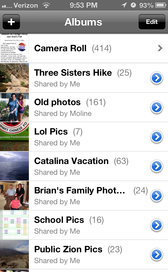
The goal of PhotoStream is simple. Take a picture and PhotoStream will put that picture on all of your other devices. It's beautiful really. Majestically simplistic. If only it were presented that way. Instead, anyone opening up Photos.app on their iPhone see's the PhotoStream tab at the bottom, and the Albums tab right next to it. This is a nightmare for most users. What is the difference between the tabs? Why are some of my pictures there and some aren't? What are Shared PhotoStreams? Why are those different from Albums? Don't both of these tabs do the same thing? This whole mess could be eliminated if the PhotoStream and Albums tabs were combined,not just in a mash up, but in a little more elegant of a way. We all know how PhotoStream looks, so I won't take any more time explaining it, let's just leave it at "confusing", and "not elegant".
Another great feature of PhotoStream is the "Shared PhotoStream" feature. This lets you organize your photos in "Streams" and share them with other people, or publish them to a private website. I personally love this feature and my family uses it all the time to share photos. My biggest complaint is that if I have this awesome shared stream, why do I still need the "Albums" tab? (I know that this is mostly for iTunes sync reasons, as pictures synced from iTunes go there, but there is no reason for this anymore). Shared PhotoStreams and Albums do the same thing: Organize photos! Why can't they just be on the same tab?
A Truly Elegant Solution

Let's boil PhotoStream down to its essence, what does it do? It syncs camera roll photos between devices. Ok, so why not integrate PhotoStream with the Camera Roll? Lets look at an ideal Photos experience.
PhotoStream in iOS 7
Instead of a confusing second tab, that for some reason is out of sync with the first one,lets look at a concept like the one here. Instead of two tabs, we have the plain camera roll but with a little cloud, similar to what iTunes does with music. The pictures with a cloud are in the cloud (simple enough)! Photos would be uploaded to the cloud just like they are now and until they are fully uploaded, they would remain cloud-less. These photos would be organizable in shared photo streams and be instantly sharable with others.
Also, since this is our idealized version, we changed the main tabs too! Gone are the old Photostream, and Albums tabs. Now they are combined into on beautiful Photos tab.Shared Photostreams are treated just like albums and can be shared just as they can be now. Pictures taken in the Camera Roll are uploaded to the cloud and can be organized into these streams.Gone is the old 3 different screen malarky, and in its place is one screen, one simple screenwith all the previous information bundled up nicely. Albums are PhotoStreams and PhotoStreams are Albums.
The Wrap Up
Apple announced PhotoStream in the same manor as they did iCloud, as a background service that you knew was there, but didn't have to worry about. It just worked. I think they pulled it off well in certain aspects like iCloud Backup which runs every night and you'll never need to worry about. PhotoStream was supposed to be the same way, instead though, we got an addition to the Photos app that only confused the majority of users. In our concept though, we have removed the additional tabs, and replaced it with a simple UI tweak that lets the user know whats going on without confusing them. We have eliminated the confusion between Albums and PhotoStreams, we have done what Apple prizes most; we made it simpler. Update: It looks like the ideal Photos.app experience is already present in iOS. Its part of the photo picker for 3rd party apps. Hopefully, they can expand on this to make the whole photos experience a lot smoother.
TL;DR: PhotoStream looks bad, I thought of how to fix it. Go look at the pictures to see how.
